
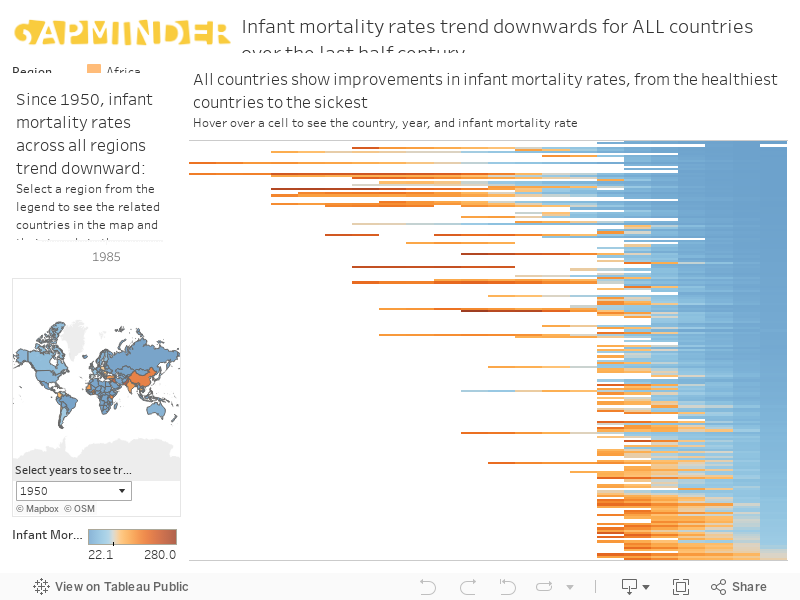
There’s a common misconception out there that we live in a world much worse than we did a century ago. In some ways we do, but it so many more ways we live a much better world. One of the best ways to measure this is through global health numbers. In the last fifty years or so, infant mortality rates plummeted around the world. Even the sickest developing countries in the current world are generally better off than the developed countries were in the middle of the 20th century. I created a Tableau dashboard for Code Magazine last year to illustrate a process for taking a collection of charts and turning them into meaningful data visualizations that communicate the key messages from the data. You can explore the data yourself in the embedded Tableau dashboard below.
You can also check out how I created this dashboard in the Code Magazine article link below!

https://www.codemag.com/Article/1911101/Best-Practices-for-Data-Visualizations-A-Recipe-for-Success
The magazine article link includes the starting and ending file if you want to try out the updates yourself.
-HW